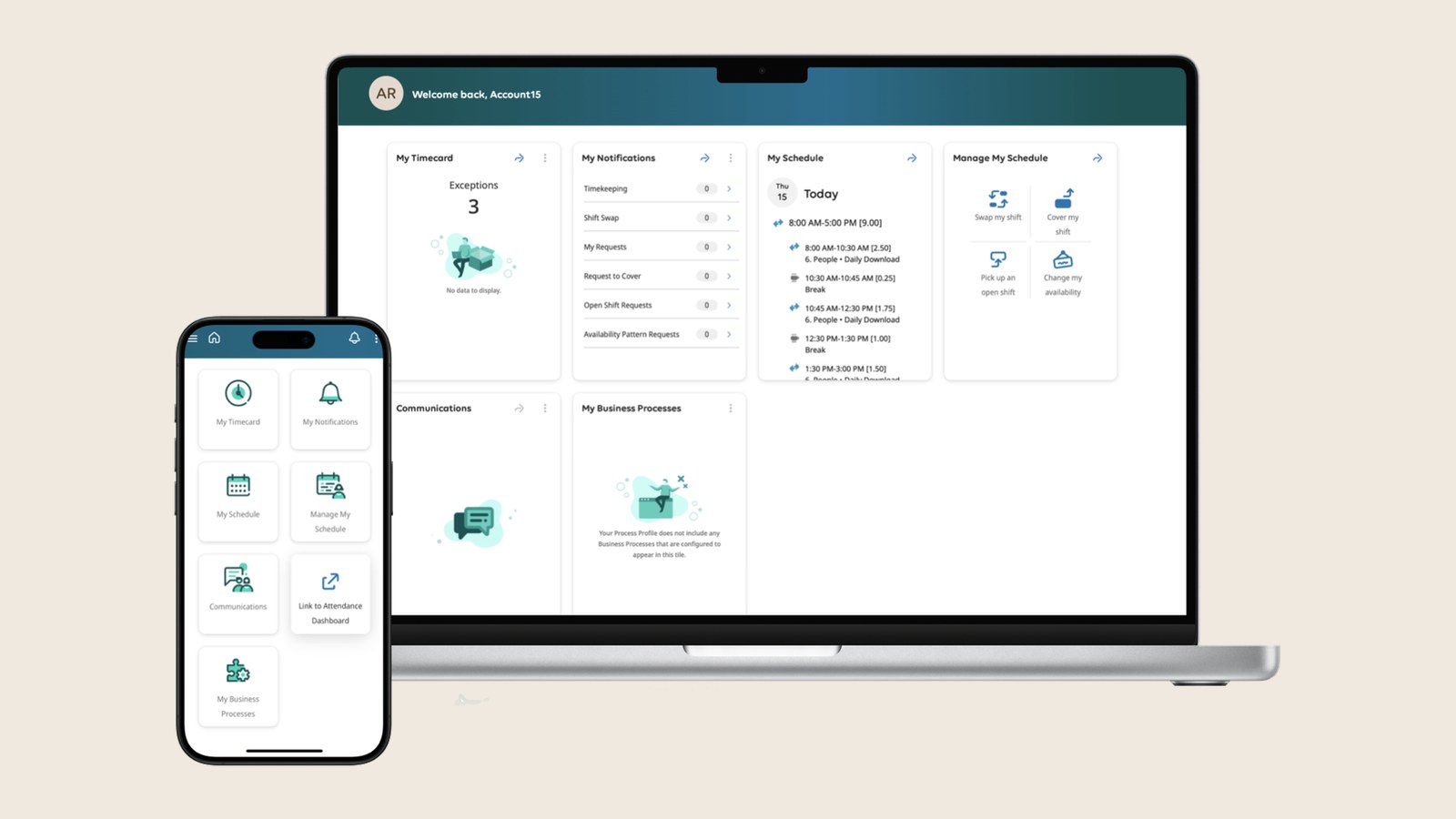
The most important finding was about confidence. People could complete their tasks, but the system never confirmed that a correction had gone through. When the task is fixing your own pay, that uncertainty stays with you long after you close the screen.
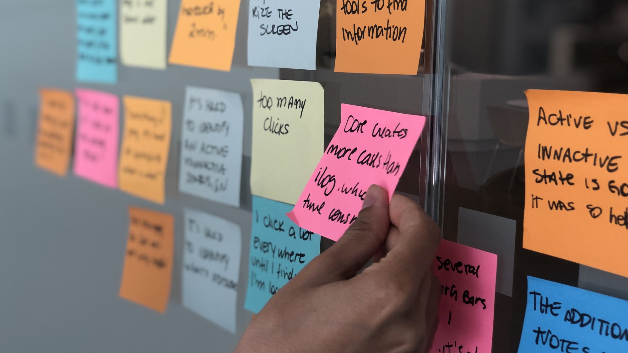
I turned the findings into a ranked list, organized by root cause. Internally, it shaped the training curriculum, set the communications timeline, and got confusing terminology renamed before launch. With the vendor, I let the data make the argument: how often each issue occurred, how often people failed the task, and where the cost would land. A task people can't find, for example, becomes ticket volume for the People team. Every item was a specific, scoped fix instead of a redesign request, and several shipped, including some that had been ruled out of scope.
After launch, a new scheduling screen shipped with five color-and-pattern combinations displayed at once. I tested it with five people who use that screen all day. Within seconds, all five reacted without any prompting, and three described physical symptoms. The screen passed WCAG, which measures whether colors contrast enough to tell apart, but WCAG doesn't account for chromatic vibration, the shimmering effect created when strong patterns sit side by side. I grounded the finding in published vision research by Ware and Wilkins and in the ISO 9241-112 standard, so the case rested on evidence instead of taste.
The vendor accepted the finding and adopted the term. They named pattern reduction as the leading fix and put the release under review while they worked out what to change. Not every change has shipped yet, but a roadmap that had been treated as closed was reopened by a customer with no authority over the product, on the strength of the research.